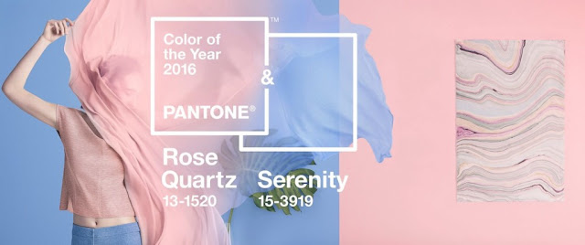
Pantone Colors of 2016
Hey Beauty Bees,
With a New Year, comes new trends! "Annually, Pantone declares a particular color 'Color of the Year'. The results are published in Pantone View, which fashion designers, florists, and many other consumer-oriented companies purchase to help guide their designs and planning for future products." This tradition has been going on since 2000 and we have been graced with some amazing shades.
For the first time Pantone introduced two shades, Rose Quartz and Serenity as the PANTONE Color of the Year 2016, along with its colors that matched well.
Rose Quartz is a persuasive yet gentle tone that conveys compassion and a sense of composure.
Serenity is weightless and airy, like the expanse of the blue sky above us, bringing feelings of respite and relaxation even in turbulent times.
In my opinion, I think these two shades together are a great choice. They definitely compliment each other and I love the softness of them. The last few years have been bright, intense shades and this year is giving us some calmness. I can see myself using Rose Quartz a lot in my beauty and fashion choices throughout the year. Serenity would be more of challenge since I am not the biggest fan of light blue, but small steps like jewelry or nail polish can definitely be a way to include it.
Below I have given you a ton of ideas on how you can include these chosen colors into your daily life!
Beauty
Fashion
Lifestyle


I just love this year's colors!! Can I have one of everything please? Especially that Smeg toaster! So cute! =)
ReplyDeleteYes! The kitchen appliances in these color are just gorg!
Delete